Advanced Typography: Task 3

10/6/2024 - 8/7/2024 (Week 8 - Week 13)
Lim Yu Xuen / 0359676
Advanced Typography / Bachelors of Design (Hons) in Creative Media / Taylor's University
Task 3: Type Exploration and Application
TABLE OF CONTENTS
✿ Lectures
✿ Proposal
✿ Sketches
Final Submission
✿ Feedback
INSTRUCTIONS
Find out other information about this module below
Module Information
LECTURES
All lectures are completed in
Task 1: Exercise 1&2
TASK 3: TYPE EXPLORATION AND APPLICATION
Task To Do:
- Create a font that is intended to solve a larger problem or meant to be part of a solution in the area of your interest be it graphic design, animation, new media or entertainment design or any other related are not necessarily reflecting your specialisation. End result: a complete generated font (.ttf) with applications.
- Explore the use of an existing letterform in an area of interest, understand its existing relationship, identify area that could be improved upon, explore possible solutions or combinations that may add value to the existing letterform/ lettering. End result: a complete generated font (.ttf) with applications.
- Experiment. For your idea to quality as an experiment it must be novel and unique — working with material that might be 3-dimensional, digitally augmented, edible, unusual, typographic music video or fine art. End result: defined by student.
- The end outcome could be a designed font and its application in the form or format that it is intending to provide a solution to, or a designed font that adds value to an existing use, or an experimentation output that results in something novel and unique. The work can manifest into any kind of format related to the issue being solved or explored or experimented: animation, 3d, print, ambient, projection, movie title or game title, music video, use of different material etc.
Process — Proposal
In Week 8-9, I presented my ideas to Mr Vinod during class. The first idea
is to create a font inspired by NewJeans album. The second idea is to add
details into an existing font that was created for agent Clove in
Valorant.
Figure 2.1.1 Presentation Slides (Proposal)
In the end, Mr Vinod suggested to go for my first idea, as the second idea
could be complicated and hard to complete within the given deadline.
Besides that, he noted that the first idea could be used as an inspiration
to create a new tuscan font. With this feedback, I started to sketch and
digitalise my ideas on this.
Process — Inspiration
First, I started looking for Tuscan Fonts online, to understand the
different types and examples. The definition of Tuscan font is:
- Tuscan font refers to a typeface that exhibits the distinctive characteristics of the Tuscan style in typography.
- These fonts are typically decorative, ornate, and often have exaggerated features, such as bold serifs and intricate detailing.
- Inspired by the 19th-century wood type designs, commonly used in vintage, western, or antique-themed designs.

Figure 2.2.1 Tuscan Font tips
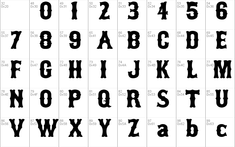
Figure 2.2.3 Tuscan Font Example

Figure 2.2.4 Completed Tuscan Font Example
- Ornate Serifs: Often large and elaborately designed
- Decorative Elements: Intricate patterns and flourishes
- Bold and Eye-catching: Designed to stand out and grab attention
- Vintage Appeal: Evokes a sense of historical or old-fashioned style
Process — Sketches
Before starting to digitalise my ideas, I went ahead and sketched out the
letters on paper.

Figure 2.3.1 Sketches of Uppercase
Process — Developing the Font
#Uppercase
To start, I used the shape builder tool to build the shape I want. Using
these 3 guides, I made sure the shapes of the letters are maintained.

Figure 2.4.1 Guides Used
With the guides, I am able to have the letters in consistent sizes and
shapes compared to the other letters. Attached below is the letter B, as
an example, with the guides.

Figure 2.4.2 Letter B and Guides
I started with uppercase letters A to L. I have a few different options
for each letter, which I kept as process, and did not delete it, as
recommended by Mr Vinod.

Figure 2.4.3 Uppercase Letters A to L
Then, I continued to finish Uppercase letters M to Z.

Figure 2.4.4 Uppercase Letters M to Z
After receiving feedback from Mr Vinod, I made a few changes to
letters B, K, and G. The letter B looks better with the empty part
having top and bottom reflected. Letter K's downward stroke can be
more consistent. Letter G looks better with curve, to imitate letter
O, and adds a little personality.

Figure 2.4.5 Side to Side Comparison of letters changed
I made changes and adjusted each letter after receiving feedback.
Completed uppercases below.
Figure 2.4.6 Uppercase Letters Completed
#Punctuations
Using the same guides used in creating the uppercases, I started
completing my punctuations.

Figure 2.4.7 Punctuations
Some of the feedback I received was to make sure the comma (,) and
semicolon (;)'s comma should be below the baseline and not aligned
with the period (.).

Figure 2.4.8 Comma and Semicolon below baseline
After making the changes, I aligned all punctuations into a row to
make sure it is consistent and in the same height. Below are the
completed punctuations.
Figure 2.4.9 Completed Punctuations
#Numbers
I continued creating the numbers following the same guides as usual. I
kept the process in of each number in an artboard, so its organised and
easy to refer back to.

Figure 2.4.10 Process of Completing Numbers
After making the final decisions on the letters I want to use for my
numbers, I finalised it in a row which is in the figure below.

Figure 2.4.11 Completed Numbers
Process — Importing Font to FontLab
Before importing the final attempt of font construction to FontLab, I
made sure all the shapes of each letters are combined into one. I used
the outline view to know whether all the letters have any details
needed to be fixed.
Figure 2.5.1 Uppercase Letters in Shape Outline
Figure 2.5.2 Punctuations in Shape Outline
Figure 2.5.3 Numbers in Shape Outline
Then, I copy and pasted each letter into FontLab 8 (using the
10 days trial).

Figure 2.5.6 FontLab 8
Some of the tools I have used to adjust the kerning of the fonts are
these:

Figure 2.5.7 Edit Kerning

Figure 2.5.8 Comparing Alphabets to adjust kerning
Figure 2.5.9 Preview Panel to check kerning

Figure 2.5.10 Kerning Window
Font Information
Download the Font here: Click
HERE
Font Presentation
For font presentation, we were asked to put together 5 artwork to
present the font that we created. Before starting, I went on Pinterest
to look for photos that represents my font's name which is: Vistas
Tuscan
Vistas — the term is referred to a pleasing or scenic view,
often expansive and distant.

Figure 2.6.1 Inspiration
Most of the photos I have used are from Pinterest. I layered photos with
textures to add a bit of touch into details. Below is the screenshot of
the layers and process of completing these font presentations.

Figure 2.6.2 Progress

Figure 2.6.3 Final Font Presentation
- Font Presentation #1: I layered a texture on top of a close up photo of a leaf. I lowered the opacity of the photo, so that the visibility of the text is increased. In the text, I included all the uppercase letters, numbers, and punctuations. I thought the corners are a bit empty, so I decided to include the font name, my name, and other details.

Figure 2.6.4 Font Presentation 1(JPEG)
- Font Presentation #2: I used a paper texture image found on Pinterest. After that, I added elements of leaves to sync with the "plant-nature" theme I am using for all my presentations. I included the name of the font as the title, and wrote my name as the description.

Figure 2.6.5 Font Presentation 2(JPEG)
- Font Presentation #3: I found a photo of the hills on Pinterest. Then, I decided to explain the definition of Vistas, which is the name of my font. In short, Vistas is "The View". Hence it is used as the title which blends with the hills, making it interesting to look at. Besides that, I included the complete definition of Vistas at the bottom of the image.

Figure 2.6.6 Font Presentation 3 (JPEG)
- Font Presentation #4: I used a textured image, and elements that reminds me of the older times, as my font is a Tuscan type font, and usually is used in similar designs. The elements are shaped using Pen Tool. Then, I included all the uppercase letters, punctuations, and numbers, that is in my font.

Figure 2.6.7 Font Presentation 4 (JPEG)
- Font Presentation #5: I used an image of a cowboy on a horse, and added the name of my font as the title that is centred in the image. Besides that, I found my font's letter V and A being closed together, looking like a fence. Hence, I added this at the bottom of the image, making it less plain.

Figure 2.6.8 Font Presentation 5 (JPEG)
Figure 2.6.9 Font Presentation (PDF)
Font Application
For font application, we were tasked to put together 3 artwork to
present the font that we created. I first looked through Pinterest for
some ideas related to cowboy, tuscan, font applications.
At first, I could not find a lot of inspiration as my theme of neutral
tones, cowboy, tuscan, has very limited examples online. Hence I decided
to brainstorm and think about items that could be suitable for my
font.
- Font Application #1: Looking at this tuscan font application (Chips packaging). I got inspired to do a version for my first font application. I used a mock up image of the chips packaging online, and uploaded it into Photoshop to recolour it to black and grey using Blending Modes. After that, I imported the photo into Illustrator to add elements like: lines, texts, graphics. The moustache was traced out using the Pen Tool.

Figure 2.7.1 Idea 1

Figure 2.7.2 Font Application 1 (JPEG)
- Font Application #2: I had the idea of including stationery for my application. Then, I decided to try making washi tapes. In Illustrator, I made a wash tape design with elements in my Font Application 2, which includes: lines, letter A and V, and also a text in between the borders, I <3 Vistas !!, which also means I Love Vistas !!. With the help of plugins in Figma, I am able to use the wash tape mock up for free, and took a screenshot, it was then uploaded into Illustrator after removing the background.

Figure 2.7.3 Figma Progress

Figure 2.7.4 Font Application 2(JPEG)
- Font Application #3: I found a mock up background for poster on Canva, and uploaded it into Illustrator. I used my font as the title, which I named it as a "movie's name". I added a few elements that represents the cowboy aesthetic, which is the theme I was going for. These elements were found online through Freepik, as free vectors. Besides that, at the bottom left corner, I added a short description.

Figure 2.7.5 Font Application 3 (JPEG)
- Font Application #4: I used Illustrator to make a simple design of a packaging, using the same texture as Font Presentation 2. I added the text Thank You! for your purchase, at the bottom left corner, as it fits the overall theme. Besides that, I made a round shape logo design on Illustrator, then imported it into Figma to create a sticker. The packaging design mock up was also done through Figma. Both of these elements were then imported back into Illustrator, to pair it with the striped background.

Figure 2.7.6 Illustrator Process

Figure 2.7.7 Figma Process

Figure 2.7.8 Font Application 4 (JPEG)
- Font Application #5: I realised that I did not do fashion pieces for my applications. Hence, I tried designing a T-shirt for my last application. I first found the capybara cowboy element from Freepik, and imported to Illustrator, along with a T-Shirt mock up from Canva. Then, I added a text: Capybara ?! and used Effects > Warp and adjusted the text to fit as a title on top of the capybara graphic. To make the shirt less plain, I used the same letter A&V element, and added it to the sleeves of the T-Shirt.

Figure 2.7.9 Font Application 5 (JPEG)
Figure 2.7.10 Font Application (PDF)
FINAL SUBMISSION
Download the Font
"VISTAS TUSCAN": Click HERE to download
Font Presentation (JPEG)
Figure 3.1.1 Font Presentation 1(JPEG)
Figure 3.1.2 Font Presentation 2(JPEG)
Figure 3.1.3 Font Presentation 3 (JPEG)
Figure 3.1.4 Font Presentation 4 (JPEG)
Figure 3.1.5 Font Presentation 5 (JPEG)
Font Presentation (PDF)
Figure 3.2.1 Font Presentation (PDF)
Font Application (JPEG)

Figure 3.3.1 Font Application 1 (JPEG)

Figure 3.3.2 Font Application 2 (JPEG)

Figure 3.3.3 Font Application 3 (JPEG)

Figure 3.3.4 Font Application 4 (JPEG)

Figure 3.3.5 Font Application 5 (JPEG)
Font Application (PDF)
Figure 3.4.1 Font Application (PDF)
FEEDBACK
Week 8
*Independent Learning Week*
Week 9
General Feedback:
- Refer to Teams Folders for Font Presentation Examples
- Must have a grid (Baseline, ascender line, etc.), when creating the font, this makes sures the font looks consistent.
Specific Feedback:
- Idea 1 approved, Idea 2 is not recommended, as it is hard to implement complicated elements into the typeface.
Week 10
General Feedback:
- Use grids and guides for ascender, descender, and x-height to assist in designing a letterform, it maintains consistency.
Specific Feedback:
- Need more consistency in my sketches, can start digitalising.
Week 11
General Feedback:
- Make sure that all the letterforms are within the 1000pt art board
Specific Feedback:
- Make E and F's middle part more consistent, have the same dented shape as the top of the designed letterforms
Week 12
General Feedback:
- Refer to teams post for kerning guides
Specific Feedback:
- Import font into Fontlab 8, and adjust kerning
Week 13
Specific Feedback:
- Start creating Font presentations (5), and Font applications (3). Have a fixed colour palette so it looks consistent and clean
REFLECTION
Experience
At first, I was very stressed out as I find it hard to construct a font.
With different ideas pouring in, but execution is hard to get done with. I
struggled with deciding the direction of my font. But after trying and
asking for feedback from Mr Vinod, I was able to come out with a font that
satisfies me. It is not the best, but I will continue to strive harder in
the future.
Observation
Through this assignment, I learned to be more mindful of the consistency of
my font. Besides that, it is important to make use of the outlines view to
view the small details, and adjust them, as these minor details can make a
huge difference. Besides that, I learned to use shapes and grid lines to
guide and construct my letterforms. Without these guides, I wouldn't be able
to make sure my letters are consistent.
Findings
Creating a font involves a tedious process, and a lot of time. It is
important to start earlier so I would have enough time to complete all the
steps required before the deadline given. It was challenging as there are
many assignments to complete for other modules as well. Nevertheless I
enjoyed the process of documenting the creation of my new font.
FURTHER READING
Typography Referenced: A Comprehensive Visual Guide to the
Language, History, and Practice of "Typography"
by Allan Haley, etc.

Figure 4.1 Typography Referenced by Allan Haley
Type History and Timeline
The historical development of type dates back to the ancient
Greeks.
- Fifth Century BCE — Greek lapidary letters, letters carved into hard surfaces, were one of the first formal uses of Western letterforms. The Greeks adopted the Phoenician alphabet for their own needs, and as a result, changed several letters and created the foundation for Western writing.
- First Century BCE — Roman monumental capitals are the foundation for Western type design, as well as the ancestor of all serif typefaces.
- Second Century BCE — Roman lapidary letters exemplified transitional letterforms from ancient Greek to the more modern Roman shapes and proportions.
- Fourth and Fifth Centuries CE — This time period saw square capitals, formal hand-written letters that evolved from Roman monumental capitals.
- Eight through Eleventh Centuries — Thanks to Charlemagne, Carolingian minuscule became the basis for the standard lowercase (332) alphabet.
Fourteenth and Fifteenth Centuries
- Johannes Gutenberg (1394-1468)
- Did not invent movable type, printing press, printing ink, not the first person to print with metal type
- Created the art of typography
- Synthesised all existing devices into an economical and practical product
- His adjustable mold, allowed a letterform model produced by a designer to be replicated thousands of times
- He took these products and combines them into works of typographic art
- After 500 years later, his art is still considered some of the best ever produced
2.
Nicolas Jenson (1420-1480)
- One of the first printers to cut and use fonts based on Roman rather than Northern European Fraktur letterform
- Willian Morris's Golden Type
- Jenson Oldstyle released in 1893 by American Type Founders
3. William Caxton (1421-1491)
- Introduced to England the craft of printing with movable type
- Successful businessman and government official before his typographic career
- Printed one of the first commercial advertisements (Poster that extolled the products and services of his shop)
- Earliest fonts he used came from mainland Europe, but he convinced a noted Flemish calligrapher to be a typeface designer to produce type fonts
- Caxton produced 8 fonts for his press
- Blackletter style of northern Germany — ancestor to Old English types still used today
- 1410 — Gutenberg Bible was printed, the first important book printed in moveable type
- 1476 — Caxton set up his printing business in the Almonry of Westminster Abbey