Design Principles: Project 1
6/2/2024 - 22/2/2024 (Week 1 - Week 3 )
Lim Yu Xuen / 0359676
Design Principles / Bachelors of Design (Hons) in Creative Media / Taylor's University
Task 1: Exploration
TABLE OF CONTENTS
✿ Lectures
✿ Design Principles
2. Contrast
3. Emphasis
4. Balance
5. Repetition
6. Movement
8. Symbol
9. Word & Image
✿ Feedback
INSTRUCTIONS
Task 1: Exploration (20%)
Explore 9 design principles taught in the module and observe works of design to apply your knowledge. Document these in your blog.
- 9 Design Principles: Gestalt theory, Contrast, Emphasis, Balance, Repetition, Movement, Harmony & Unity, Symbol, Word and Image.
- Describe one goal from the UNSDG (United Nations’ Sustainable Development Goals)
- Select an existing art or design work that revolves around the goal of your choice. Beneath the image, include the credit line (title of the work, artist’s name, year, size, medium, source link)
- Explain, in about 100-150 words, why you chose that design in relation to the UNSDG goal and list the design principles you observed in that design.
Marking Criteria:
- Exhibits the ability to explore, observe and demonstrates an overall understanding of the design principles.
Marking Rubric:
- Beginning (0-4)— Limited results. Lacking the sense of the overall understanding of design principles.
- Developing (5-9)— Shows some exploration and understanding of the design principles.
- Mastering (10-15)— Has good observation and shows good understanding of the design principles.
- Outstanding (16-20)— Integrates information from multiple sources and able to describe the principles accurately.
Learning Goals:
- To explore and observe the various design principles.
- To identify an existing design with relevance to design principles and the chosen goal.
Timeframe: 2 Weeks (Week 1 - Week 3)
Deadline: Week 3
Find out other information about this module below
Figure 1.1 Module Information
LECTURES
Introduction to Elements & Principles of Design
Dr Yip gave us a brief about the module information booklet that was provided in the Team’s files section. We were assigned to
watch all the pre-recorded lectures that were posted on MyTimes and
Microsoft Teams. Dr Yip also explained various design principles that were
important to prepare for our future projects.
Figure 2.1 Week 1 Lecture
Topic 1 Recorded Lecture
In this recorded lecture, we were introduced to 2 design elements which
are:
Contrast & Gestalt theory
.
Dr Yip explained in detail about both principles and provided us with the
lecture slides.
Figure 2.2 Topic 1, Contrast & Gestalt Theory,
Source
Topic 2 Recorded Lecture
For this lecture, we were introduced to 2 more design elements which are:
Balance & Emphasis. The lecture slides are provided in MyTIMES while the recorded video was
uploaded on YouTube. Both principles were explained in detail, I did further
readings to understand both principles clearly.
Figure 2.3 Topic 2, Balance & Emphasis,
Source
Topic 3 Recorded Lecture
In this lecture video, the 2 design principles that were explained are:
Repetition & Movement.
I watched the recorded lecture that was provided to us, and read through
the website links provided by Dr Yip, to supplement my learning of these
principles.
Figure 2.4 Topic 3, Repetition & Movement,
Source
Topic 4 Recorded Lecture
For this topic, Dr Yip explained clearly on 2 more design principles which
are: Harmony & Unity. Extra information was given in MyTimes, just in
case there are students who are interested to dive in deeper to these
principles.
Figure 2.5 Topic 4, Harmony & Unity,
Source
Topic 5 Recorded Lecture
For the last lecture recording, it explains the last 2 design principles:
Symbol, Word & Image. In the video, I have learnt about the reasons why
symbols are used in design, the different types of symbols, and the
definition of word & image.
Figure 2.6 Topic 5, Symbol, Word & Image,
Source
DESIGN PRINCIPLES
1. Gestalt Theory
Definition: Gestalt refers to "shape or form" in German. Gestalt
principles are laws that describes how the human eye perceive and group
visual elements, such as patterns and simplifying complex images.
6 Theories:
Principle of similarity, Principle of continuation, Principle of
closure, Principle of proximity, Principle of figure, Principle of
symmetry and order.
Principle of Similarity
- Principle of similarity states that when things appear to be similar to each other, we group them together. We also tend to think they have the same function (Creative Beacon, 2012, Source).
- For instance, in the picture below, human eyes usually group the circle elements in the middle together to form a diamond. We see this diamond because we process similar objects together, to easily organise them and take in the information. Besides that, we can also see that there is a group of triangles in a form of a square. This means that we see a diamond of circles inside a square of triangles.

Figure 3.1.1 Shape formations demonstrating Principle of Similarity,
Source
Principle of Continuation
- This principle of continuity explains elements are arranged on a line or curve are perceived to be more related than elements not on the line or curve. To be exact, this principle explains how our brains perceive lines or shapes as continuing in a flow even though it is interrupted by other elements. Viewers tend to perceive elements (that are in a continuous flow) together to form a pattern.
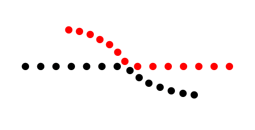
Figure 3.1.2 Lines demonstrating Principle of Continuation,
Source
Principle of Closure
- The principle of closure states how humans view incomplete or fragmented visual stimuli as a complete object. Viewers often mentally fill in the missing gaps with its imagination and perceive it as a complete object.
- In short, when you see an image that has missing parts, your brain automatically fill in the blanks and turn it into a complete image so you can recognise the pattern or object.
- The closure principle is often used in logo designs. Some examples are listed below.
Figure 3.1.3 IBM logo demonstrating Principle of Closure,
Source

Figure 3.1.4 WWF logo demonstrating Principle of Closure,
Source
Principle of Proximity
- The principle of proximity states that things that are close together appear to be more related than the things that are spaced further apart. Spatial arrangement of visual elements influences our perspective of the element's grouping. Proximity is so powerful that it overrides similarity of colour, shape, and other factors that might differentiate a group of objects.
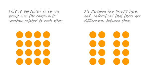
Figure 3.1.5 Understanding Principle of Proximity,
Source
- Some example of principle of proximity is that the nearness of images and the corresponding texts shows that they are related to one another
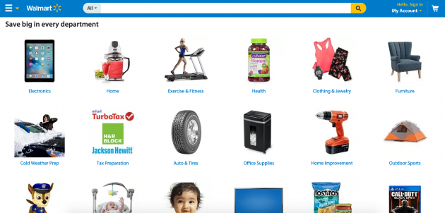
Figure 3.1.6 Walmart website demonstrating Principle of Proximity,
Source
Principle of Figure / Ground
- The principle of figure-ground states that people instinctively perceive objects as either being in the foreground or the background. They either stand out prominently in the front (the figure), or recede into the back (the ground). Humans perceive and interpret visual stimuli by differentiating between the main subject (the figure), and the background (the ground). This perception allows us to distinguish between objects and its surroundings.
Figure 3.1.7 Book cover demonstrating Principle of Figure-ground,
Source
Principle of Symmetry & Order
- This principle suggests that humans naturally perceive objects as being symmetrical and is contented by symmetry, order, or follow a predictable pattern (Research Collective, 2018, Source).

Figure 3.1.8 Logo Designs demonstrating Principle of Symmetry and
Order,
Source
2. Contrast
Definition:
It is the juxtaposition of dissimilar elements (such colour, tone, or
emotion) in a work of art. Contrast is also known to imply an emphasis on
differences, provide visual interest, and express content. Contrast can be
created by using elements in colour, size and position.
There are various types of contrast in art. It consists of: colour
contrast, texture contrast, shape contrast, line contrast, size contrast,
edge contrast, temperature contrast, and space contrast. The
three
common type of contrast that can be seen in any medium of art includes:
colour contrast, size contrast, and texture contrast.
Colour contrast
- Contrasting Colours is a term used in colour theory to describe the difference between different colour hues (Adobe, 2024, Source ) It helps to create a visual interest and to make certain elements stand out.

Figure 3.2.1 Poster Design demonstrating Colour Contrast,
Source
- Contrasting Colours also creates a visual hierarchy by using vibrant colours for important elements, such as headers and call to action buttons. This attracts the attention of users to focus on the emphasised information.

Figure 3.2.2 App Log In Design demonstrating Colour Contrast,
Source
Size Contrast
- Contrasting sizes of elements can be emphasised to attract user's attention. The eyes naturally seeks out to the larger object, interpreting it is more important.

Figure 3.2.3 Sunscreen Product Photo demonstrating Size Contrast,
Source
Texture Contrast
- Contrasting textures enhances the textile appearance of artworks, by adding depth, depict the illusion of movement, or create more drama in the artwork. (YourArtPath, 2023, Source ). Texture in contrast can be achieved by using smooth and rough surfaces in an artwork together.

Figure 3.2.4 Lotion Product Photo demonstrating Texture Contrast,
Source
3. Emphasis
Definition: Emphasis serves to draw the viewer's attention to a
specific design elements, different elements such as
colour, shape, or size
can be employed to achieve this dominance and focus in a design
work. In short, emphasis is what designers use to draw the eye of the reader to
specific elements.
Colour Emphasis
- Colours can be used in many ways to create emphasis. One of the easiest ways is to put important texts and informations in a coloured box, or to give the text itself a colour. (Venngage, 2022, Source). This allows the texts to be highlighted and it will naturally draw the attention of viewers.

Figure 3.3.1 Weekly Inspiration poster design demonstrating Colour
Emphasis,
Source
Shape Emphasis
- If a designer uses a specific group of similar shapes on a page to organise your content, then suddenly use a different shape to border a picture, this will naturally draw attention to viewers. The human eye is naturally drawn to a break in the pattern of various objects or elements in a composition (Brand Fabrik, n.d, Source).

Figure 3.3.2 Example of Shape Emphasis,
Source
Size Emphasis
- Size is one of the most universally applicable ways to create emphasis. Making an element larger or smaller can affect its overall value and importance in that artwork. One of the common ways designers apply size emphasis is to make important text information larger compared to the body text. This promotes the point of the poster design, and catches the reader's eyes immediately.

Figure 3.3.3 Poster design demonstrating Size Emphasis,
Source
4. Balance
Definition: Balance in design refers to how visual weight is
distributed in a composition. Visual equilibrium of the elements can
cause the elements to appear balanced.
There are a few main types of balance: Symmetrical Balance,
Asymmetrical Balance, The Golden Ratio, Rule of thirds.
Symmetrical Balance
- It is a mirror image balance. If you drew a line down the centre of the page, all the visual elements of the left side should be mirror to the right side equally. These elements do not have to be identical but can be in similar colour, shape, scale and so on.
- Symmetrical balance can be used in formal design, or to include a sense of structure, organisation and stability (Gareth David, 2017, Source)

Figure 3.4.1 Poster design demonstrating Symmetrical Balance,
Source
Asymmetrical Balance
- It is used to describe a kind of balance that is not identical on both sides of a central line.
- Asymmetrical balance occurs when several smaller visual elements on one side are balanced by a large or small visual element on the other side which will be placed further away from the central line (centre of the screen)
- Asymmetrical balance can be used when a designer would like to achieve a more casual or less planned look and feel. An asymmetrical composite can create greater dynamics which evokes viewer's sensations. It keeps the audience's attention focused on the visual message. (Gareth David, 2017, Source)

Figure 3.4.2 Poster design demonstrating Asymmetrical Balance,
Source
The Golden Ratio
- The Golden Ratio which is also known as the Golden Section, Golden Mean, Divine Proportion, or the Greek letter Phi, is a special number that approximately equals to 1.618. It originated from the Fibonacci sequence (the sum of two numbers before it, 0,1,1,2,3,5,8,13,21...to infinity)
- The Golden Ratio is related to design because it refers to a line dividing two parts, the longer part (a) divided by the smaller part (b) is equal to the sum of (a)+(b) divided by (a), with both equals to 1.618. This formula helps with creating shapes, logos, layouts, and more.
- The Golden Ratio has been regarded as the symbol of perfect beauty and has served as a blue print for achieving visual harmony in design. (Inside Design, 2018, Source)

Figure 3.4.3 Photo demonstrating the use of Golden Ratio,
Source
- The Golden Ratio has been used in design to install harmony, balance, and structural integrity into artworks. This makes the artworks more appealing. Some of the ways to apply The Golden Ratio is listed below.
Figuring out what size font to use for headers and body

Figure 3.4.4 Typography and defining hierarchy,
Source
Identify which space to cut out and keeping the focal point
in the middle

Figure 3.4.5 Cropping and resizing images,
Source
UI Design to draw user's attention to information that
matters the most

Figure 3.4.6 Layout,
Source
Sketch out proportions and shapes when designing a logo

Figure 3.4.7 Logo development,
Source
Rule of thirds
- This guideline enhances the dynamics in design, photography, film, or paintings. The image will be evenly divided into thirds (horizontally & vertically) with the subject positioned at the intersections of these dividing lines or along one of the lines.

Figure 3.4.8 Painting demonstrating Rule of thirds,
Source
5. Repetition
Definition: Repeating designs in artworks can establish
rhythm and pattern in composition. Another way of thinking about repetition
is consistency, when choosing a set of colours, it is better to
use one that's already connected to your brand / design, rather
than something new.
Repetition also means reusing elements like colours, patterns,
fonts, images and more, throughout a piece of artwork.
Rhythm
- Rhythm arises through the repetition of patterns. Rhythm guides our eyes from one point to another in a work of art. It is created when one or more elements of design are used repeatedly to create a feeling of organised movement.
- Artists create repetition by using the same shape, colour, size, value, line, or texture over and over again.
- Below is an artwork by Katsushika Hokusai: The Great Wave, the use of repeating colours of different shades and tints of blue and white curvilinear shapes on the tips of waves creates rhythm.

Figure 3.5.1 Artwork demonstrating Rhythm Repetition,
Source
Pattern
- Patterns are simply a repetition of more than one design element in an artwork. A seamless pattern is when every elements within a design combine to form a whole, no matter how often it is repeated. It can create a sense of holistic comfort and simplicity. A more disjointed pattern, will break the flow of certain elements, can draw our attention to certain parts of a page and create emphasis.

Figure 3.5.2 Artwork demonstrating Pattern
Repetition,
Source
6. Movement
Definition: Movement is the manner which design
leads the eye around and through a visual composition. It
refers to the way the eye travels over a design. The most
important element should lead to the next most important
and so on.
Movement can be derived from shapes, form, lines and
curves that are used. It also can be depicted through
hierarchy and alignment.
Hierarchy
- It refers to organised elements to convey importance through positioning, scale, and colour, leading the viewer's eye through a predetermined path. Visual hierarchy guides the user's attention from focusing on the primary details, rather than the secondary details.
- Below shows examples of Visual Hierarchy.

Figure 3.6.1 Poster demonstrating Hierarchy Movement,
Source
Alignment
- It is the positioning of design elements so that the edges align along shared rows or columns or their centre aligns along on the axis. Good alignment can bring harmony and consistency within the composition, fostering unity and stability. It can also lead viewers throughout the design.
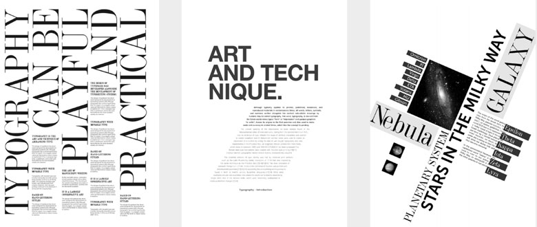
Figure 3.6.2 Artworks demonstrating Alignment
Movement,
Source
7. Harmony & Unity
Definition: Harmony
is the sense of blending and unity obtained when all
elements of a design fit together to create an
orderly, congruous whole. These elements should share the
same characteristics so that they can complement one
another. On the other hand, Unity refers to some design
elements being repeated throughout the piece.
Unity arises when these elements are arranged to feel like a
whole, hence creating a specific theme. Unity is the
principle that controls the overall cohesiveness of an
artwork.

Figure 3.7.1 Poster demonstrating Unity,
Source

Figure 3.7.2 Poster demonstrating Harmony,
Source
Scaling (Unity)
- Scale refers to the size of an element in relation to another element or a reference point, such as the page, the screen, or the human eye.
- Scale can be determined by actual measurement or visual estimates based on comparison.
- Scale can affect how your audience perceives your message, brand, and identity.
- By manipulating scale, it is possible to create contrast, hierarchy, harmony, emphasis, drama, and mood in your designs.

Figure 3.7.3 Poster demonstrating Scaling,
Source
- Architectural drawings and scale models are examples of the applied use of scale. Also, scale is used to specify or illustrate details based on the relative sizes of objects.
- Substantial deviation from a normal scale relationship can create dramatic results and visual interest within the design or composition.
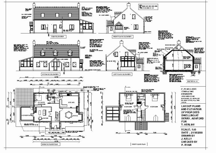
Figure 3.7.4 Architectural Drawing demonstrating Scaling, Source
Proportion (Unity)
- Proportion refers to the ratio or balance of an element in relation to the whole composition or a specific part of it.
- Harmony can be brought about with the right proportion and relationship between elements.

Figure 3.7.5 Artwork demonstrating Proportion,
Source
8. Symbol
Definition: A sign, shape, or an object used to represent something.
In design, symbols are used to bring across information or messages that may
be equivalent to sentences or even paragraphs.
Symbols are split into: Figurative representations and Non Figurative
representations.
Figurative representations: Pictorial symbols, Abstract symbols, Arbitrary
symbols.
Pictorial Symbols
- Mostly Image Related and Simplified Pictures

Figure 3.8.1 Artwork demonstrating Pictorial Symbols,
Source
Abstract Symbols
- Have similarities to the object they plan to represent but with lesser details

Figure 3.8.2 Artwork demonstrating Abstract Symbols,
Source
Arbitrary Symbols
- Have no relevance to the object they represent but is deigned based on geometrical shapes or colours. For instance, Green can mean safety, Red can mean danger, Yellow can mean caution.
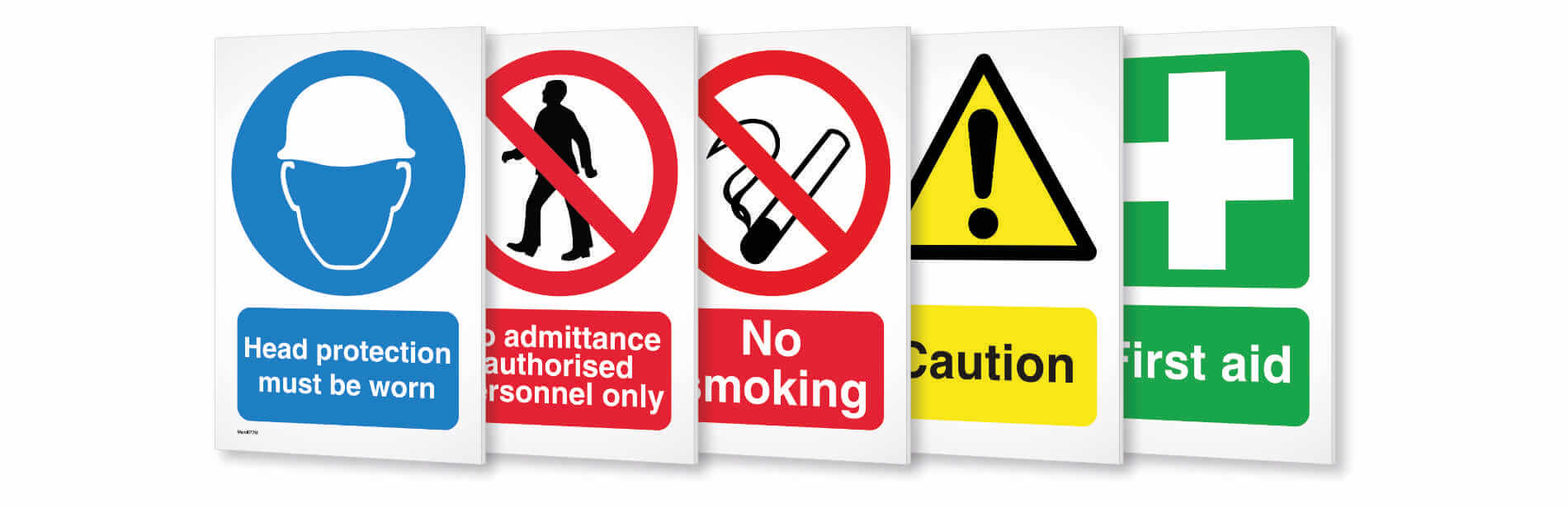
Figure 3.8.3 Artwork demonstrating Arbitrary Symbols,
Source
9. Word & Image
Definition: Image is vital in design, it can be seen on print
or digital. It allows viewers to relate to a concept or brand,
therefore it is important to use suitable and relevant images when
designing.
Choosing the right words to pair with the image is vital as it will
deepen the meaning of the design. Suitable typeface and positioning of
the type will result in visual hierarchy and balance in a work of
design. Typography is the design and arrangement of text to ensure
message is being conveyed.

Figure 3.9.1 Poster demonstrating Word & Image,
Source
UNSDG GOALS & ARTWORK
Among all 17 United Nation Sustainable Development Goals (UNSDG), I have
decided on goal number 16, which is also known as Peace, Justice and
Strong Institutions.
Brief Description of Goal 16 (Peace, Justice and Strong
Institutions):
Reducing violence, combating crime and corruption, and promoting
transparent governance should be tackled as these issues has been
overtaking the world. UNSDG Goal 16, "Peace, Justice, and Strong
Institutions" aims to build peaceful and inclusive societies with access
to justice for all accountable institutions. United Nations has been
actively promoting Peace, Justice and Strong Institutions as many people
are more educated with the current topic. By working towards Goal 16, it
is crucial for sustainable development, as it encourages trust,
cooperation, equality, and well-being for all individuals and communities
around the world.
Artwork chosen representing Peace, Justice and Strong Institutions:

Figure 4.1 "World Conversation" by Alex Nabaum, 2016
Title of Artwork: "World Conversation"
Designer's name: Alex Nabaum
Year: 2016
Medium: Illustration, Editorial, Magazine
The reason why I chose this artwork is because this piece met the
visual representations of Peace, Justice, and Strong Institutions. From
what I have read, it is known that this artwork was created to promote
peace by getting people to listen to each other.
The artwork depicts understanding among differences. Muted colours of orange and teal evokes a feeling of calmness, serenity and balance. The chat bubble icons around the main symbol is to subliminally send contextual interpretation that understanding each other through communication can help settle differences. While the concept of peace, justice and strong institutions is shown in the centre which is also the focal point of the design. The earth symbol with two identical faces represents an inclusive society where differences such as races, gender, and class are overridden and everyone is treated as equal counterparts.
Design Principles Used in "World Conversation" by Alex Nabaum:
- Contrast
- Emphasis
- Balance
- Repetition
- Symbols
- Harmony & Unity
FEEDBACK
Week 2
General Feedback: Recap all the Design Principles in a proper
format, which is: try to describe each principle in our own words. Besides
that, make sure to cite the sentences we have copied from other resources,
by providing the link to the articles at the end of the sentences. Another
thing to take note is to have at least one image (do not retrieve from
lecture slides) for each principle. This is to make sure that everyone
understands each principle clearly.
Specific Feedback: Ms Yip mentioned that she liked how
organised my blog is, she loves the hyperlinks and also the highlighted
titles which really catches the attention of readers and is soothing to the
eyes. Font and size is well done, can easily read and understand. Some
things to get done with is the remaining 8 design principles, and the reason
why I chose the artwork within 100 words. She hope I will be able to
complete it by next week's class, and start on task 2.
REFLECTIONS
Overall, it was an interesting learning experience as I get to study deeper
into the few design principles. Besides that, I was able to easily spot and
understand design principles that is visible in all artworks. After
completing this project, I have given more attention to the details and
design principles that are applied in artworks, around my daily life.