
3/2/2025 - 10/2/2025 (Week 1 - Week 2)
Lim Yu Xuen / 0359676
Information Design / Bachelors of Design (Hons) in Creative Media /
Taylor's University
Exercises
TABLE OF CONTENTS
INSTRUCTIONS
Find out other information about this module below
Module Information Booklet
LECTURES
Week 1
In Week 1, we were introduced to the module Information Design,
which consists of 4 tasks: Exercise 1, Exercise 2, Project 1
(individual work), and Project 2, along with the Flip presentation
(group works). For Exercise 1, titled "Quantifiable Information", we need to select and prepare an
object for analysis.
Week 2
In Week 2, Mr. Fauzi delivered a lecture on L.A.T.C.H Theory, which stands for Location, Alphabet, Time, Category, and Hierarchy. It is a framework used for organizing information effectively.
He explained how each principle helps in structuring data in a
meaningful way, making it easier to interpret and visualize.
Throughout the lecture, he provided a few examples and real-world
examples (applications) of L.A.T.C.H Theory, demonstrating its relevance in information
design.
EXERCISE 1: QUANTIFIABLE INFORMATION
Task Requirements
-
Quantify and visually present data using a set of objects.
Mr. Fauzi provided us examples using coins, buttons, lego
bricks, and showed us the process from raw data to a
structured, visually appealing representation.
-
Objective: Quantify raw data and visualize it as a photograph.
Present numerical data visually for each interpretation.
Work Progress
1. Choose Objects
While brainstorming for ideas, I had several things in my room
that I thought of using it for this exercise. But I still had to
consider that these items can meet the requirements and provide
me with enough details so I will be able to have more
information in my exercises. After going through Pinterest and
senior examples, I decided to go for a set of
brush pens.
Figure 3.1 Chosen Objects
2. Reference & Sketch
With the object in mind, and many ideas floating around my
head, I decided to make a board for all the references and
ideas. This helped me brainstorm and kind of allowed me to
described my ideas better to Mr. Shamsul. After receiving
feedback from Mr. Shamsul, I decided to arrange the brush pens
next to my initial idea which includes a RYB color model.
Besides this, I want to include different strokes and brush
lettering into my arrangement.
Figure 3.2 References
Figure 3.3 Sketch
3. Arrange for Visualization
I started arranging the colours of the brush pens into
their respective groups. By drawing a big circle using a
compass, and brush lettering the titles of the colours
according to RYB color model. Besides that, I also made
sure to write down all the codes of each brush pen color
that can be refered at the back of the brush pen.
Figure 3.4 Completed drawing arrangement
4. Final Outcome
To make use of the white space, I laid all the brush
pens next to the color codes so it is easy to identify
the colors and the pens. I also included the table of
basic strokes on the bottom right corner.
Figure 3.5 Final Outcome
EXERCISE 2: L.A.T.C.H INFOGRAPHIC POSTER
-
Organise a set of information into a visual poster
using L.A.T.C.H principles. Use digital photo
editing or illustration software to design the
infographic. You can reuse images, but you must
create additional visual elements to complete the
poster.
-
Objective: Create a visual infographic poster that
organises information using at least four of the
L.A.T.C.H principles: Location, Alphabet, Time,
Category, Hierarchy.
Work Progress
A. Concept
Development (Mood board & Visual
References)
After researching for some ideas, I decided to work
on the title: Coffee Types. I have always admired
the history about coffee, and the taste of different
types of them, hence I decided to do some research
on the background of coffee for my poster
design.
Title: Coffee Types
Introduction: "Coffee is
more than just a drink—it’s a culture, an art, and
a science. From the bold intensity of espresso to
the smooth richness of a latte, coffee comes in
various types, each with its unique preparation
and taste. This infographic categorizes coffee
types based on Location, Alphabet, Time, and
Category, offering a structured guide to
understanding your favorite brews.
Coffee Types:
-
Americano – Espresso with
hot water.
-
Cappuccino – Espresso with
frothed milk.
-
Cold Brew – Brewed with
cold water over time.
-
Espresso – Strong,
concentrated coffee shot.
-
Flat White – Espresso with
microfoamed milk.
-
Latte – Espresso with
steamed milk and light foam.
-
Macchiato – Espresso with
steamed milk on top.
-
Mocha – Espresso with
chocolate and milk.
-
Ristretto – Shorter, more
concentrated espresso shot.
-
Turkish Coffee – Finely
ground coffee brewed unfiltered.
Proposal
Figure 4.1 L.A.T.C.H Infographic Poster Proposal
Visual References
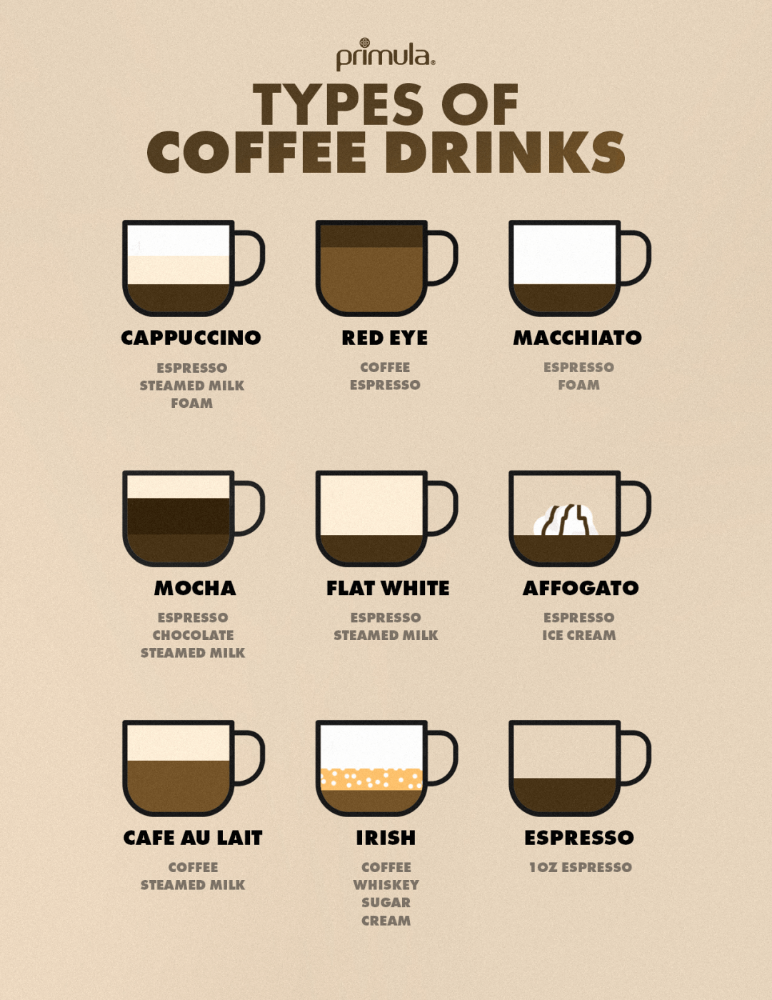
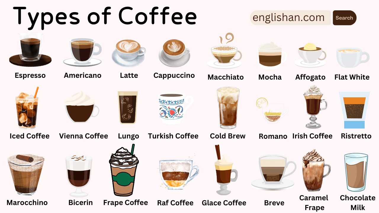
Figure 4.2 References
Figure 4.3 References
Typography & Colour Scheme
I wanted the colour scheme to be matching with the main elements which
are the coffee illustrations, so I went ahead with brown shades as well as
a font that is easy to understand.
Fonts
Figure 4.4 Font 1
Figure 4.4 Font 2
Colour Palette
Sketches
I created a few layouts for Mr Shamsul to give feedback on, and decided to
proceed with layout -.
Sketch 1
Sketch 2
Sketch 3
Within these sketches, Mr Shamsul mentioned that he likes the first &
second idea. I proceeded with both layouts in digitalisation process.
Digitalisation in AI
I started with deciding on the main element which are the coffee cups. I
looked through Pinterest for a few inspiration, but the only problem is
not all coffee types are in the same drawing style. I decided to draw and
make my own so that each coffee cup are in the same art style.
Figure 4.7 References for art style
Figure 4.8 Coffee Cup Illustrations
After completing the main elements (coffee cups), I decided to start on
the arrangement of the layout. While referring to the google document
proposal, I made sure all the coffees are in the right order.
Figure 4.9 Coffee Cups in order
Figure 4.10 First Draft
After drafting the layout, I decided to keep this idea but make further
adjustments based on the comments and feedback received. This was to
change the typeface, and keep in mind of the visual hierarchy, and
readability of the texts.
Figure 4.11 Photoshop Flags
I used Photoshop to edit the flags into circles, and used Clipping
Mask for it too. I then imported them into Illustrator.
Figure 4.12 Icon Sketches
To replace the emojis, I drew all 4 using the same art style, which is
Milk, Espresso, Water, and Sugar. This made the overall design
cleaner.
Figure 4.13 Close up of Icons in Use
Figure 4.14 Second Draft
In my second draft, I realised the art style of the coffee looks
very complicated compared to the overall aesthetic and graphics of
my poster. I decided to redo it.
Figure 4.15 Redo Coffee Cups
Finally, I have concluded my final design, some of the important
information will be written below for references.
Figure 4.16 Overall Progress
Final Outcome
Font Choices
- Header — Changa One
- Body texts — Poppins
Colour Palette
- Black — #221f20
- Beige — #f3e0d3
- White — #FFFFFF
JPEG
Figure 4.18 Final Latch Infographic Poster (JPEG)
PDF
Figure 4.19 Final Latch Infographic Poster (PDF)
Reflection on Exercise 1: Quantifiable Information
Experience
For this exercise, it took awhile to choose the object I want to use
for my exercise. By carefully planning out the layout and ideas for this
exercise, I managed to showcase my skills in brush lettering as well. It
was a fun and challenging experience as I had to plan and brainstorm
outside the box.
Observation
I observed that the process of arranging the layout and the items
helped me with my indecisiveness, and up-ed my interests in colour
theory models. Selecting a way to display the brush pens is also very
important to meet the aesthetic of the eye.
Findings
Through this exercise, I am able to learn about the RYP color model.
Besides that I get to train my brush lettering skills to put it into use
for this exercise. Laying and visualising where to put the brush
lettering pens on the piece of paper is also very important to fill in
the empty spaces. This method of quantifying really helped me learn more
about colours and different strokes of brush lettering.
Reflection on Exercise 2: L.A.T.C.H Infographic Poster
Experience
Working on this infographic, I had to read through many articles and
information about coffee. I really learned the basics and different
types of coffee which really made an impact into my daily life as I
personally am a coffee drinker as well. As I progressed to complete this
exercise, I learnt to be patience with the layout design and that having
different options are important as a selection for feedback
as well. To complete the exercise, I made sure to go through different
examples to ease my decision in colours, fonts, layout. I also made use of
my design principle knowledge to make sure the poster is neatly
designed.
Observation
I learnt that making small changes to my poster can make a big
difference. Even though to me I prefer certain sizes and layouts, but
having Mr Shamsul's feedback really opened an eye to helping me
understand and visualise the reasons why making these changes can be
improvements to my poster. By tweaking the sizes of the graphics, the
font size, colours, and also the spacings, the information would be
easier to read and makes my poster more visually appealing.
Findings
Since getting feedback and being more observant towards my poster
design, I learnt that the small adjustments can make a big difference. I
also get the opportunity to dive into the topic of coffee and it peaked
my interest in designing for coffee shops. The examples and references
was really interesting to look at, as the art style and graphics are
very consistent and meets the aesthetic of a cafe. I also learnt that
visual hierarchy is very different too.


_page-0001.jpg)