Typography: Task 3

14/11/2023 - 13/12/2023 / Week 8 - Week 12
Lim Yu Xuen / 0359676
Typography/ Bachelor of Design (Hons) in Creative Media / Taylor's University
Task 3: Type Design & Communication (Font Design)
୨୧ __________________________________________________________ ୨୧
TABLE OF CONTENTS
1. Lectures2. Instructions
14 November 2023
Lecture 8 (Recess Week)
21 November 2023
Lecture 9
Ms Hsin Yin and Mr Vinod gave us feedback and opinions on the design style that would be the best. We spent the day in class sketching and correcting our letters and symbols. Mr Vinod also taught us different methods to digitalise our typefaces. It was recommended to incorporate lines, shapes and strokes. We also learnt new tools such as the pathfinder and width tool.
28 November 2023
Lecture 10
Ms Hsin Yin and Mr Vinod looked through the drafts for our digitalised typeface. They gave us helpful feedback on how to make it better. After that, we receive individual feedback and started to make improvements on our letterforms. At the end of the class, My Vinod mention some information to take note before importing our letterforms into FontLab.
5 December 2023
Lecture 11
Ms Hsin Yin gave more feedback on a few minor mistakes made in my letterforms. She also gave us an extra week to further refine our letterforms on Illustrator before importing into FontLab. We used this time to fix the minor details on our letterforms.
12 December 2023
Lecture 12
Ms Hsin Yin and Mr Vinod instructed us to download FontLab 7 and import our fonts from Illustrator to FontLab. They proceeded to give us a short lecture on how to work with kerning in FontLab and gave us the time to kern our typefaces. Afterwards, we have to export our typeface from FontLab and create a poster with it.
Task 3: Type Design & Communication (30%)
Design a limited number of western alphabets. To begin, we were required to choose an existing font that adheres to the direction that I would like to head in. Afterwards, we had to study the font carefully by analysing its anatomical parts.
Start with rough sketches, explore a variety of options and upon begin digitisation of the drawings- the softwares required for digitisation are Adobe Illustrator and later Fontlab. Artworks shall be printed out for critique sessions followed by refinements. If time permits we shall generate the font for actual use.
You will endeavour to create a typeface that has the hallmarks of a good typeface; subtlety or character, presence, legibility, and readability.
Below are the letters to design:
- a e t k g r I y m p n ! # , .
- All gathered information (failures, successes, epiphanies, sketches, visual research, printouts, websites, images, charts, etc). Must be documented logically and chronologically in the portfolio for the duration of the task in one post
- All images / sketches / diagrams / scans must be captured / photographed / scanned well, with good even natural light, without shadows- use of tube / bulb / flash light is not allowed. All images / sketches / diagrams / scans but be labelled (fig 1 , 2 , etc.), described and dated. Final submission must be indicated clearly (distinguishable from process work) and uploaded as PDF ad JPEG & .TTF (True Type Font) or as instructed in class.
- Tasks to be documented in a printed A4 enclosed in a Clear Sheet, logically and chronologically. The works must be labelled and dated- use pencil and write neatly.
- Evidence of in-depth research and visual analysis is visible
- Multiple ideas have been explored with great care and deliberation
- The design process showcases knowledge of typographic convention, methodology and production
- The designs are extremely well crafted, consistent and technically sound
- To develop student's ability to design a font with consistent characteristics premised on research and analysis
- To develop student's ability to design a font with consistent characteristics premised on research and analysis
- Week 8 - Week 9 (Deadline: Week 10)
Read more about this module below
୨୧ __________________________________________________________ ୨୧
3.1 Research
Before getting started on drafting my desired letterforms, I made good use of my time to do some ample research on the anatomy of typefaces. I researched on different letterforms.
Anatomy of typefaces:
I looked through the internet for more details regarding the anatomy of typefaces. The anatomy of typography or type refers to the visual elements that come together to form the letterforms in a typeface. Each letterform comprises of various components like the spine, stem, and stroke.
When type designers are creating typefaces, they make sure to carefully craft these components which are essential in determining the overall look and readability of the typeface.
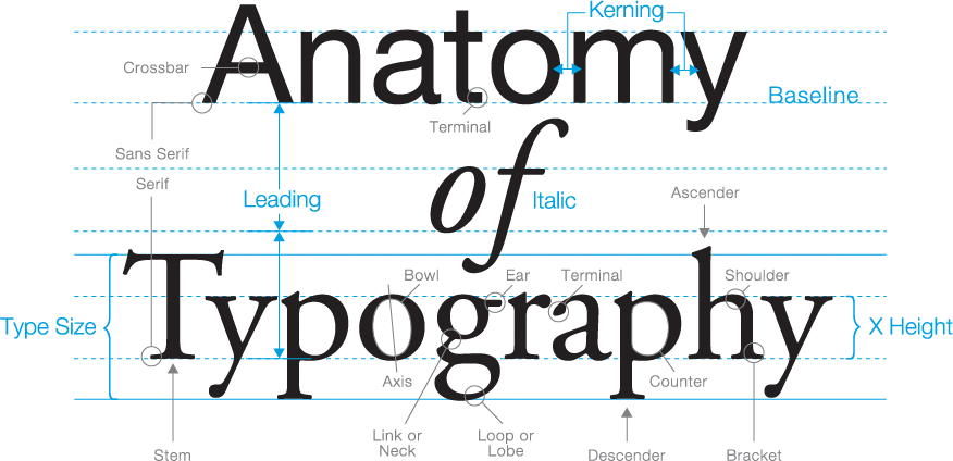
Figure 3.1.1 Anatomy of typeface, source , Week 7 (8/11/2023)

Figure 3.1.2 Visual guide to the anatomy of typography, source , Week 7 (8/11/2023)
3.2 Deconstruction of letterforms
Ms Hsin Yin tasked us to choose a serif and sans serif typeface to deconstruct and analyse the details. It is important to understand what are the changes made in these typefaces.
The font that I decided to deconstruct is:
Sans Serif - Futura Light
Serif - Futura Oblique
3.3 Sketching of alphabets
We were instructed to prepare 9 different sketches using 3 different types of pens. The pens that I have used are: Flat tip pen, round tip pen, and a calligraphy pen.
Top Row: Flat tip pen (Black)
Bottom Row: Calligraphy pen (Blue)


After receiving feedback, the final chosen sketch was refined and ready to be digitalised.
3.5 Digitalising of words
We were required to use Adobe Illustrator to digitalise our words. I first chose a similar font for reference. After that, I turned the text into shapes by pressing on (Type > Create Outlines). Next, I used the Direct Selection Tool to drag the outlines into the shapes for my first draft's format.
First Draft


Letter O

Letter D


At first, I was confused whether which direction I shall put for the top and the bottom of the letter E. After aligning all 3 drafts of the letter E, I noticed that most of the letters I designed had the top rounded downwards and the bottom flat and curved upwards. After making some minor changes, the final draft of the letter E is made.

Letter S


Letter I

Letter # , .


2.5 Development of Font in FontLab 7
After finalising our digital font in Adobe Illustrator, we were instructed to import them into FontLab 7 to work on the kerning and spacing of the letters. I made sure that the settings in FontLab met the guidelines and was set correctly before proceeding to copy and paste each letter from Adobe Illustrator. In my first draft, I worked on the kerning of each letter to ensure that the spacing looks tidy and easy to read.


After exporting my font, which I decided to name 'Ninja'. I installed it on my laptop, and created a posted as instructed. We were tasked to form words and sentences with the font that we have created in an A4 sized art-board. Some are words I came up with are: cool, nice, noelle, god, design, he, she and so on. In the end, I have decided to choose the words- NOELLE IS SO COOL ! for my final poster design.


3.7 Final Submission Materials
Download font here:
https://drive.google.com/drive/folders/19oDs-1_5xuWf6EmaMzefKUqqLVfmH9XV?usp=share_link
FontLab Screengrab


Final Poster Design (PDF)
୨୧ __________________________________________________________ ୨୧
Experience: This task was one of the hardest and tedious to complete. It is very different compared to what I have learnt and tried before in this module. Nevertheless, I understood that designing a font is a totally new task for me but I am eager to try, no matter how hard it takes.
Observations: While designing a font, I learnt to look through other fonts for inspiration and kickstarters. Although it may look easy, but the behind-the-scenes of creating a font is very time consuming. I also learnt that small mistakes can cause a huge difference in the digitalisation phase.
Findings: Creating a typeface requires skills such as, precision, patience, technical skills and so on. I think it is very important to make sure the typeface we are designing has a consistent design. This makes sure that the letters are all similar in a sense that it is easy to read for the viewers.
୨୧ __________________________________________________________ ୨୧
Typography Referenced
by Jason Tselentis
.png)
Figure 4.1 Typography Referenced, Week 12 (13/12/2023)
From page 207 to page 233, is a chapter about design principles by Jason Tselentis. The design principles that were mentioned in the book are:
- Format
- Typography selection
- Reading direction & scanning
- Free placement
- Hierarchy
- Unity and Variety
- Symmetry and Asymmetry
- White space
- Contrast
- Typeface pairing